Tuesday, October 15, 2019

26 best education website design ideas that skip to the head of the class

Having a well-designed education website is an ideal way to show who you are as an establishment, whether you’re an existing institution or building your education brand from the ground up.

Education website design
Get ready for a crash-course in education website design. Illustration by Orange Crush, web design by Mithum.

Remember, you’re providing both a valuable and invaluable service: knowledge. The best education website design solutions will support this knowledge through a clean layout, captivating images and engaging features.

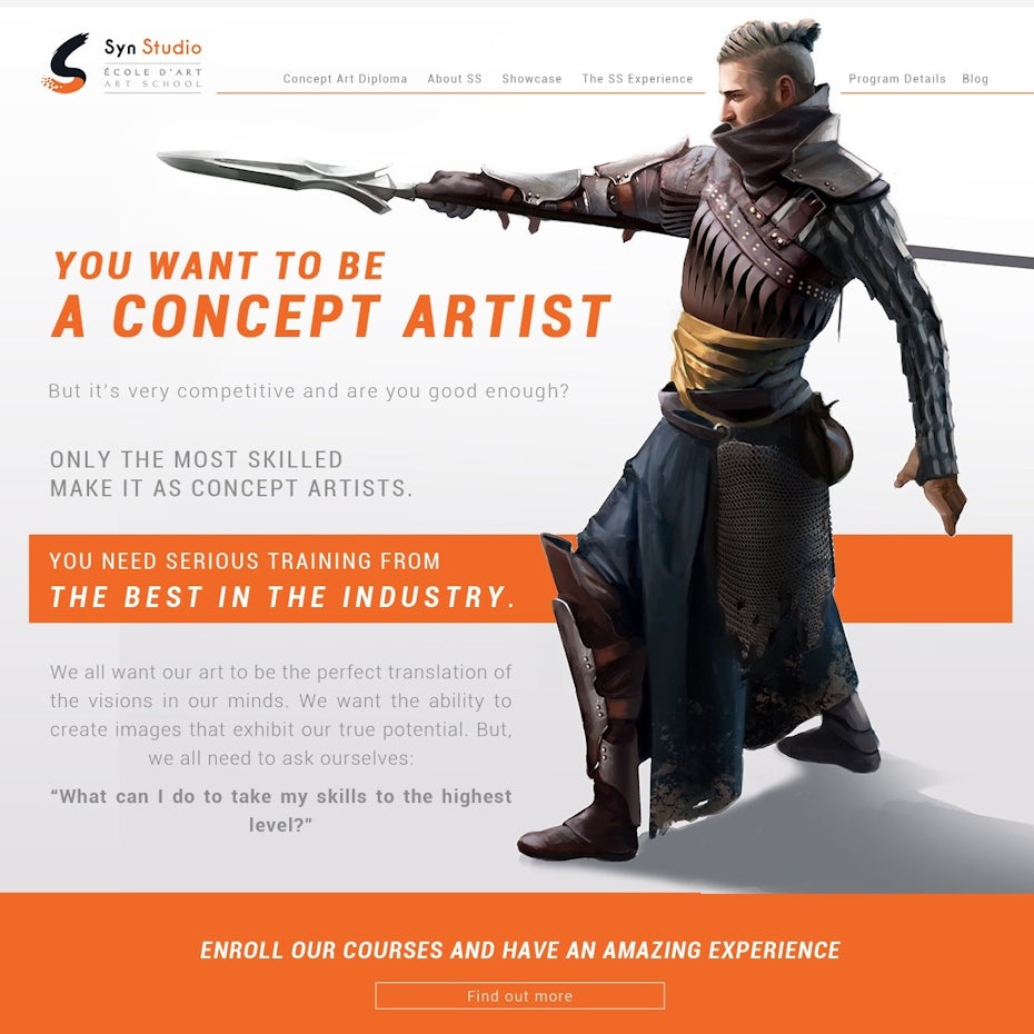
Higher education and professional school websites

The purpose of this type of website is to uphold the overall brand of the university or college. A higher education website contains a great deal of important information for students, faculty and staff. Additionally, it’s a way of representing the campus culture for prospective students.

Drexel University website
The Drexel University home page is full of navigational cues, but they are organized and separated in such a way that it never feels cluttered or confusing.

Web design for a biomedical research instituteWeb design for an art institute

Web design for professional training courses
This website communicates the nautical vibe of the school’s town as well as the professional vibe of the student body. Design by UndoRedo

What works well?

When it comes to higher education website design, the competition is fierce. The landing page needs to be simultaneously simple and striking in order to hold the attention of the visitor, especially if they happen to be a prospective student.

University of Montana website
via University of Montana

Look for a hero image that encompasses what makes your university unique. In the case of the University of Montana, the hero image celebrates homecoming season by highlighting their marching band. It’s timely, it’s engaging, and it gives the visitor an in-depth look at what makes campus life so great. This is your time to really show off.

While a great hero image will encourage the visitor to stick around and explore, a clean design will help them make the most of the website experience. Think about simple, easy-to-comprehend categories which your user needs to see. Make everything clear and clickable. Create an intuitive, functional layout and remember to factor in a way for the navigation to work on a mobile device. Universities are going to have a lot of portals for students and faculty, so your navigation menus will need to be particularly well organized. Start with the three As of higher education website navigation: academics, admission, athletics. Then, branch off from there.

Elementary and high school website designs

While the overall goals of elementary and high school websites are similar to that of a higher education website, the audience is completely different. These websites are most likely to be visited by parents and employees, rather than the students themselves. But still, they’re a great resource for important information, so it’s important to display everything clearly.

Academy for Thinkers website
This design by Gabriel™ makes student life the priority with a photo-centric approach

High school web page designWeb design for elementary school education

Tutoring and SAT prep web design
by AdrianBotea

What works well?

Think about what a parent wants to see when they visit the website for their child’s school: they want engagement.

Little Seeds Academy website
Websites for younger students can appeal to curiosity and imagination inherent in education. Design by slf1986

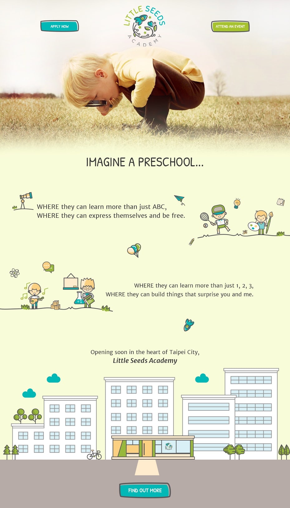
Try showing a variety of interactive photos, like students at play or students with teachers in a classroom.

Focus on all the little things that make your school great, and most importantly, show how happy the students are when they’re at school. Be authentic with this approach. Avoid stock photos, and instead, invest in a photographer who can capture your student body in its natural environment.

For the navigation, think about things that parents care most about. For example, the best education website design solutions will have an easily accessible calendar feature. It sounds obvious, but actually, the calendar is often overlooked. Plain and simple: it’s truly one of the most important features for parents who need to know about breaks, holidays, exams and school-wide events.

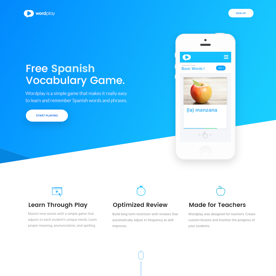
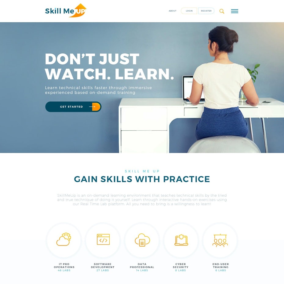
Online education and e-learning website designs

Get schooled without leaving the house? Score. Online education is a growing field, and the backbone to any online education platform is a thoughtfully designed website. If the entire educational experience takes place in one digital environment, it can’t be anything short of excellent. And an online education doesn’t have to mean homeschooling or online college—it can also be something quicker and simpler, like a course on Lynda or Skillshare or even a mobile app that lets students learn a new language.

Online learning web design
Because e-learning takes place in a digital environment, you can trade the photographic approach for illustrations. Design by Max Iver

Spanish vocabulary landing pageE-learning web page design for digital marketing

Language Learning landing page
This web design by Simplywebs99 is easy to navigate and gives prospective students a visual snapshot of the world they are about to enter by learning Japanese.

Web design for an online learning platformWeb design for an e-learning platform

Web design for an e-commerce education platform
Education websites for more digital skills can get away with a modern look. By Design Castle.

What works well?

True story: clean, minimalist design works well in nearly any digital space. Online education websites are no exception. It’s as easy as ABC: a digital learning space should allow the student to have a very easy time getting where they need to go. Don’t make it too complicated. Opt for easy-to-read fonts on bold buttons with simple calls to action, like “learn more about our courses” or “start your free trial now.”

Online learning website for Saas
Color and a simplistic layout is key for helping users navigate. Design by Adrian Hufsa.

The difference between this type of education website and others is the student will essentially live within the digital environment. This means particular attention must be paid to the profile and the course browsing pages. Make sure the student can easily find courses, understand their contents and can see how long each one will take—right down to the minutes—all at a moment’s glance. The student profile should be simple to use and act as a main hub where they can organize notes and create their own lesson plans. Even the most eager students can find self-motivation challenging, so make it easy on them by designing eye-catching measures and badges that demonstrate progress.

How to earn top marks with your education website design

Appeal to a diverse faculty and student body

When deciding on the visual aspects of an education website, there are many important factors to consider. Be strategic. This website could be the decision-maker for those who are interested in gaining knowledge from your institution or becoming employees who share their knowledge with others.

Skillshare websiteWeb design for corporate education services

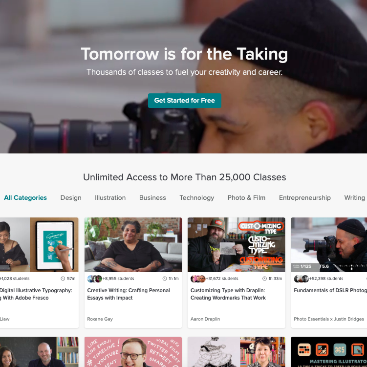
Aim for universal appeal to any audience. The Skillshare website is a great example of universal appeal. The colors are neutral, the layout is easy to comprehend and the content is diverse. In the case of a higher education website, universal appeal means that your site should be attractive to the vibrant, curious student audience as well as the professional, experienced faculty or staff audience. Make it clear that everyone is welcome at your institution, and everyone makes up an important piece of its overall success. This can be reflected through diverse imagery and a generally neutral, ageless look. Be modern without being trendy.

Web design for a memorization learning platform
If your educational approach is unconventional, your website should be as well. This is what separates you from competitors, so show it off. By Cinnamon Pixels.

Additionally, use your website to show what gives you an edge over your competitors. Do you have an award-winning curriculum? Share your success. Is your campus filled with beautiful architecture? Let visitors see the perks right from the first click.

Extend your education brand with colors, shapes and imagery

Colors and shapes are brand-defining aspects of any business, including educational establishments. Branding is necessary and important regardless of the audience, whether it’s higher education, primary/secondary education or an online learning tool. Visual cues can help show who you are and what you’re all about. It’s what makes you memorable, and it’s a nice companion piece to your website design.

Educational website design for international students
This web design by Anron heavily relies on color as a branding vehicle. Even the binders in the header photo subtly match the brand colors.
Educational website for learning agriculture
This web design by Anton Siribaddana uses a monochrome green color pallette and the repetition of wheat imagery to convey cohesive branding.

Consider some popular education color schemes which pair well with a signature shape, like the University of Michigan’s striking blue-and-gold letter M. These colors have become synonymous with the university as a whole, and the shape is also extremely recognizable. Throughout their website, the colors stay true to the overarching theme. This intelligent, easy-to-recognize branding supports the university as a whole. Even those who have never been to Michigan and don’t follow college sports are still likely to recognize the colors and the shape.

University of Michigan website
via University of Michigan

Some of the most successful education branding ventures are those that embrace simple, visually appealing shapes. An iconic example is the Harvard University coat of arms. The rich crimson color and bold shield shape are incredibly significant to the university as a whole, and it’s also a front-and-center element of the university’s website design.

Harvard University coat of arms
Harvard University’s website design incorporates their classic coat of arms in modern way.

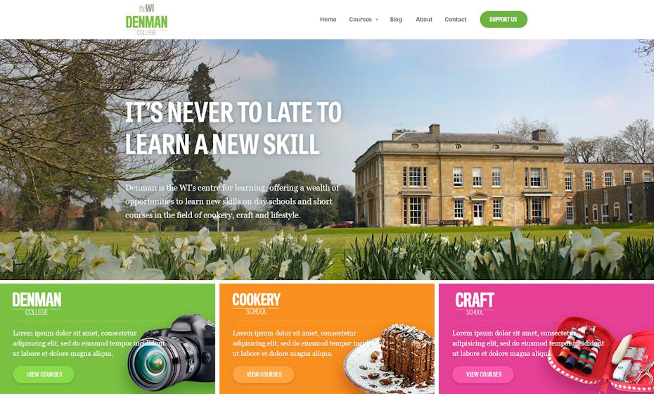
For Denman College, the headings on the website are concise and to the point. Each is supported by a vivid color to draw the eye in, but the colors are still coordinated together. Since the colors are fairly bright, the designer made the smart choice to not focus too much on unique shapes. The layout is built entirely from rectangles, which makes it easy to digest and navigate.

Denman College website
Denman College website design by akorn.creative

Long story short: don’t go over the top. Say the words you need to say with the colors and shapes which support your overall identity, then let the brand speak for itself.

Get smart with a great education website

Education is your area of expertise, and your website should support your overall goals. Just be smart. Making smart design choices can boost your brand and elevate your appeal, both for prospective students and employees.

A well-designed website is an essential part of any education venture, regardless of the type of knowledge offered or the desired audience that you’re trying to reach. Now that you’ve hit the books when it comes to website design, it’s time to bring in an expert to bring your vision to life. Connect with our global community of designers and start creating a website that’s honor roll-worthy.

Want more education web designer choices?
Find the perfect designer for your project!

The post 26 best education website design ideas that skip to the head of the class appeared first on 99designs.

26 best education website design ideas that skip to the head of the class syndicated from https://www.lilpackaging.com/

Monday, October 14, 2019

19 lawyer business cards that do design justice

It might come as a surprise but business cards for lawyers are varied and often creative. Just because the industry is serious, does not mean the business cards need to be. There is lots of room to express what the law firm specializes in, who they want to stand for and how they set themselves apart. In fact, lawyer business cards should be memorable, communicating trust and expressing confidence, so prospective clients feel comfortable.

To spark inspiration for lawyers, designers or anyone interested in what makes a lawyer business card work, we’ve compiled  examples of our favorite lawyer business cards. We think they’re tops, but you be the judge!

Modern lawyer business cards

This style of lawyer business cards are ideal for those who want to convey that they can adapt to the demands of today, even though they belong to an old world trade. These business cards are minimally designed with one or two colors for text and background at most. They tend to have geometric shapes and clean lines free of much texture or shading.

Unlike traditional business cards for attorneys, modern lawyer business cards do not contain much text beyond the name of the company. These cards are a great choice for young law firms who would like to work with newer industries like technology, with artists and many other industries who prioritize keeping up with the times.

blackbird law business card
This design is modern, easy and very clear. By Jecakp.

jinny yang tree simple business cardHameline and Eccleston business cardcatherine nilles law business card and logoround corner logo lawyer business card

Classic lawyer business cards

When designed intentionally, classic never has to mean outdated or boring. Lawyers who would like to be considered more traditional, who work with bigger or older corporations, the government, or those law firms who have long-standing relationships with the same clients should consider this type of business card because classic cards are timeless and convey unchanging trust.

Classic lawyer business cards are often monochrome, and typography is usually made up of elegant serifs for fonts. Since these cards are often quite simple, fonts play a key role. The preferred color combinations for these cards are gold and black or blue tones and white.

black and gold justice symbol business card
Black, gold and evoking timeless justice symbols. By undrthespellofmars.

green business cardblue navy logo and attorney business cardgold black greek symbol business cardblue and white attorney business card

Inventive lawyer business cards

Lawyers who are looking to work with new businesses should consider this type of business card because inventive business cards tell clients that you can think outside the box, that you understand creative demands and that you’re open and approachable. Inventive lawyer business cards are great for lawyers who want to set themselves apart and those who work solo. These business cards include details that aren’t common or expected in lawyer business cards, such as bright colors, non-traditional card shapes and other ways that stretch beyond the norm.

foldable business card
Hard not to notice this business card which replicates the law firm’s logo. Design by 1302.

purple graphic business cardpatterned, colored edge lawyer business cardgrid white and blue business cardyellow asymmetrical lawyer business card

Informal lawyer business cards

Not all sections of the law are stuffy and not all lawyers will make a dent in your wallet. Informal lawyer business cards convey just that. These business cards are great for small firm lawyers. Whether working for humanitarian or non-profit causes or with those who do not have access to big name firms, these cards tell the clients that anyone should have easy access to law expertise.

These types of cards can be handwritten or hand-illustrated, employ water-colors or use thicker papers to express a personal touch.

horse lawyer business cardhandwritten quill business law cardtree business cardmonogram card with tagline

What do you want your business card to do?

The business card you choose will be dependent on the type of law you practice and the type of lawyer you are —and the type of client you’d like to attract. Whatever you choose, remember that creativity always has a place, even in an industry as traditional as law.

Need a great business card design?
Our designer community can create the perfect card for you.

The post 19 lawyer business cards that do design justice appeared first on 99designs.

19 lawyer business cards that do design justice syndicated from https://www.lilpackaging.com/

Request smuggling: the Amazon is burning… your Go services

99designs, like many websites that take privacy & security seriously, runs a bug bounty program; we pay “good hackers” to hack us and inform us of vulnerabilities that we then fix. As a global creative platform predominantly delivered via the web, most of the issues raised are fairly unremarkable CSRF and the occasional XSS vulnerabilities, but recently we had a report that stood out and took us on an interesting journey:

Request smuggling

What is request smuggling?

Request smuggling is a type of attack whereby a bad actor crafts a HTTP request in such a way that they can cause disagreement (desynchronisation) between intermediate servers in how the request should be processed, resulting in their request being interpreted as the start of the next (probably valid) request on the connection.

In the case of this vulnerability, the disagreement arose between AWS Application Load Balancers and the HTTP library in Go, a language we love at 99designs:

request smuggling
Design by Lera Balashova. Feel free to share this infographic, but please include a link back to this blog article.

How request smuggling can be exploited

Because the attacker has complete control over the beginning of the request, there are two basic types of attacks they can perform:

The first forces random users to take actions that they didn’t initiate, e.g. liking a design or accepting a friend request. This is done by ignoring the user’s original HTTP Request-Line by turning it into a header:

POST /anything HTTP/1.1                   
Content-Length: 4
Transfer-Encoding : chunked

0

GET /like-my-design HTTP/1.1
Ignore: X
GET /any-user-request
Cookie: UsersSessionCookie

When used like this, the cookies of the original request are kept intact, but the attacker no longer has control of the body. This limits the scope of the attack to simple actions that don’t require a body.

The second form of this attack takes control of the body of a request while using headers provided by the attacker. It can be much harder to find an endpoint that is vulnerable to this kind of attack, but if found it can be catastrophic to the end-users security.

POST /anything HTTP/1.1                   
Content-Length: 4
Transfer-Encoding : chunked

0

POST /send/private/message HTTP/1.1
Cookie: AttackersSessionCookie
Content-Type: application/x-www-form-encoded

msg=
GET /any-user-request HTTP/1.1

Cookie: UserSessionCookie

In this example, the attacker has leveraged form encoding to send themselves a private message containing the user’s cookies. This would allow them to then take any action on behalf of a user. Form encoding will continue up until the first “&” in the body, which is enough to capture headers and a large portion of the body if the request was using json.

How we discovered the AWS/Go vulnerability

We learned about the AWS/Go request smuggling vulnerability on September 1st from a report by a security researcher at HackerOne (the host of our bounty program).

Internal triage and assessment

We spent the first week of September trying to understand the vulnerability and assess it’s possible impact.

We found we could not reproduce the issue in a local development environment—this lead us to believe the AWS Application Load Balancer might be involved. There were a few possible locations across our infrastructure that could have been causing the issue, so we started digging.

Detective dog
by hasahatan

We tracked the issue to the Go-based web proxy / router we use to split traffic across all of our various services and realized it was an issue between that and its load balancer. At that point, we realized that this likely meant that all Go services using the standard library with an ALB were vulnerable (I believe the exact words were “half the internet”).

This seemed like a serious issue so we escalated the problem to both the Go and AWS security teams via email. Both companies replied promptly and committed to fixing the issue: Go said they were rolling out a security fix release and AWS promised to add a setting to ALBs.

Naked guy illustration
by Denys Lobanov

Where are we now?

As of the publication of this article, this vulnerability between AWS and Go is no longer an issue on 99designs:

On September 26th: The Go team released Go 1.13.1 with a fix and submitted a CVE to MITRE.

September 30th: The next business day, we deployed the fix across our 20-something Go services.

October 1st: We paid a bounty to the security researcher who reported the vulnerability.

A huge thanks to the security researcher at HackerOne who discovered the vulnerability. Totally unsolicited plug: at 99designs, we take privacy and security very seriously, and we’ve been incredibly satisfied with the bug bounty program through HackerOne and highly recommend it.

Looking to work with a cutting-edge group of engineers?
99designs is hiring software developers.

The post Request smuggling: the Amazon is burning… your Go services appeared first on 99designs.

Request smuggling: the Amazon is burning… your Go services syndicated from https://www.lilpackaging.com/